Give Your Data Purpose with a Yield Efficiency Score

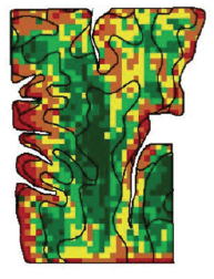
As you are gearing up for harvest, there is a nervous excitement. You are about to get your final grade for 2019. How did you do? Did you make money? Did your decisions for the year pay off? These questions may give you pause, how do you measure such a thing? Is it the check that comes in the mail from the elevator? Is it the number that comes across the combine monitor? Is it, if your harvest map is green instead of red?

We help you answer these questions to establish your goals and create strategies to achieve them. Because we know it’s not about the highest yield, it’s really about how you profit. We can show you how profitable you were with our new Yield Efficiency Score metric.

Premier Crop has found a solution to combine all agronomic inputs, operations, yield and cost to determine your Yield Efficiency Score. A Yield Efficiency Score, similar to a credit FICO score, is a single number derived from multiple factors. The purpose of the Yield Efficiency Score is to take all your collected data within each field and use it to determine your per acre return to land and management.

Premier Crop helps you get started with a Yield Efficiency Score. At a minimum, we need yield files, field information (pesticide programs, planting rates, varieties, fertility programs, and input costs) that can be entered or gained from as-applied files from the planter or applicator, and your input costs. You don’t need the most updated equipment to gain efficiency knowledge, you just have to be willing to sit down with your advisor and walk them through your farm plan during the season.

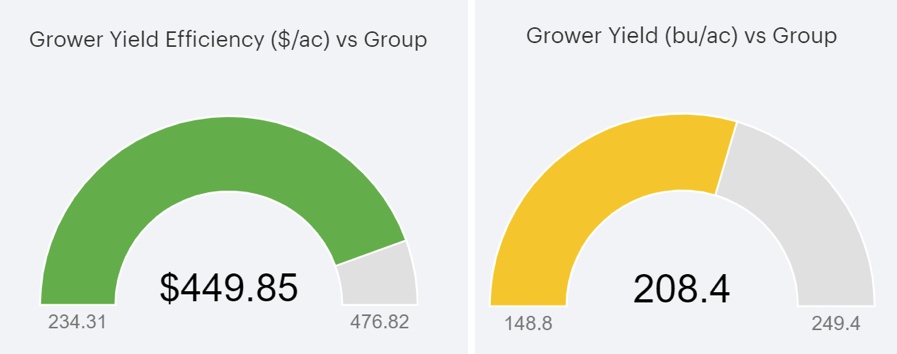
Once a Yield Efficiency Score is calculated you can visually see a benchmarking gauge that allows you to see beyond your own operation.

The Yield Efficiency Scores below are a true sentiment that obtaining the highest yield is not always the highest profit. Notice the image on the right shows that this grower has approx. -41 bu/ac less than the highest yield in the benchmark peer group, yet the image on the left indicates he is nearly the highest profiting.

yield efficiency score can determine corn profits

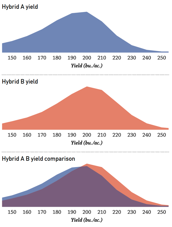
The same can be done with seed, fertilizer & pesticide products/rates/times, field management, and economics.

As you track your data, year after year we can track how your efficiency gets better over time and how the decisions you make affect your bottom dollar. The longer you are in the program, the more confident your decision making will become. We strive for continuous improvement through shared learning and increased knowledge working along side you.

Yield efficiency is the metric you may not know you are missing, but yield efficiency has the ability to transform the way you view your operation and each individual field. At Premier Crop we know you have different needs and our goal is to help you reach them. If you are interested in getting your Yield Efficiency Score, contact Premier Crop now and an Agronomic Information Advisor will be in touch with you.

Your success is our success, we strive to give your data purpose.

Analyzing Your Yield Map

Hunters and soil scientists may seem like an odd pairing but they have at least one thing in common – they know and appreciate that nature has an aversion to straight lines. Hunters spend a lot of time in and observing the great outdoors and getting an up-close look at the variability Mother Nature molded upon our landscape. Soil scientists not only spend time looking at the curvy contour lines that represent the transition from one soil type to another but their academic training is about the “how’s and why’s” of soil formation over the centuries.

Unlike nature, humans have figured out how to perfect designing straight lines! From early days of the very first mechanical planters and “cultivator blight”, the straightness of our rows was something that created neighborhood envy. Nowadays auto-steer has made it easy.

Straight lines are one of the first “gotcha’s” when studying a yield map. The cause for yield differences that follow straight lines are always man-made! It can be a variety change, a different nutrient application, a crop protection treatment, an equipment performance issue, a tillage pass or even something like a manure application we did years earlier. Seeing a straight line on a yield map instantly leads to digging deeper!

analyze yield data with your yield map

Yield maps are an awesome way to visualize data differences. However, a second “gotcha”, is not paying attention to the map legend! Years ago, I had a college friend send me an image of one of his yield maps, with a note that said “you see, we really don’t have much variability in our area.” But as I studied his map, I noticed that the predominant green color on his yield map had a 40-bushel-per-acre range.

use your yield data to check field variability

The two maps above use the exact same yield data.

There is not a “perfect” way to set map legends. The key is to also LOOK AT THE LEGEND – not just the map!

You Can’t Manage What You Don’t Measure

Private colleges market their low faculty-student ratios to compete with the draw of big universities and the message is it’s a place where we know your name. Insurance companies compete by selling the value of an agent when you have a claim vs. a phone number to call – the message is you are more than a number. These savvy marketers know that “me matters” – at some level most of us value being treated as the individuals we are. Being treated as though we are all the same as our peers – whether by age, gender, race, economic situation or other demographic insults our sense of being unique in the world.

Pretending that what is different is all the same may be how things were, but it is not how they will be in the future.

Over 30 years ago when my career started it was common that we would drive into a field, randomly pull 20 cores of soil from within the field, mix the cores in a bucket, pour a one pound sample into a soil sample bag, send it to the lab and then “pretend” the lab results were representative of the field. We would then uniformly apply a blend of nutrients for each field that best matched those soil test results, pretending that one rate of multiple nutrients was right for that field and the crop to be grown.

Sampling and applying different blends for each field was an improvement compared to not sampling and applying the same blend to all fields.

grid soil test map

While we now have the ability to easily measure variability within our fields and to manage each part of our fields uniquely, the reality is most growers don’t. Reality is, even in today, the majority of fields are still treated and managed as though they are uniform. Pretending that dramatically different geographies are the same, is still common with our agronomic recommendation system. State-wide recommendations may provide an average starting place but too often they are also the ending place.

I believe that will soon change. I believe precision ag will become agriculture’s fruit fly! Cancer researchers have discovered that at a molecular level, fruit flies share many of the common genes that are found in human tumors. A common cancer tumor with 200 mutated genes might contain 180 genes that can be reproduced in fruit flies. Researchers can order up strains with each unique mutation. Eventually they whittle the number of genes down to about ten that seem to matter. Those ten genes produce a cancerous growth in the fly that most closely resembles the one in the human being. They are basically able to construct a fruit fly that is personalized to each person’s cancer. Instead of treating cancer with a one-sized-fits-all chemotherapy cocktail, researchers are able to develop a very personal treatment that is best for each individual’s cancer.

Precision ag’s history has been about applying existing knowledge variably within diverse landscapes. The future will be about using spatial data to create new complex agronomic knowledge that can be used in the most site-specific applications possible. This will be a fundamental change – same as using a fruit fly to uniquely treat cancer!

Back to the Basics

I have never liked the warning “you don’t get a second chance to make a first impression.” It always seems to futile and irreversible. But one example that I encounter frequently relates to how variable rate applications were first positioned by the ag input industry. Years ago, when GPS was first allowing us to measure differences within fields and variable rate controller technology was being pioneered, the value proposition presented to most growers was “this will save you money.”

With the exception of variable rate applications of lime, that first value proposition seldom proved to be true. And because the “save you money” value wan’t obvious to growers, some growers gave up and reverted to straight rate applications of all inputs. At Premier Crop, we seldom talk about saving growers’ money on inputs. We realize that what we might save on one part of a field, we’ll likely spend on another part. It’s not about saving money. It’s about maximizing profit; being more efficient in how we invest all input dollars.

But that exception – variable rate application of lime – can be extremely significant in many areas and it’s worth exploring why it frequently saves so much. At some point in our farming history, most of us have seen this chart illustrating the relationship between soil pH and nutrient availability. Phosphorus (P) is a primary nutrient and a significant annual investment for most growers. Focus specifically on how phosphorus availability is influenced by pH. When I talk about why growers should know and pay attention to pH, I start with “P” availability. Correcting low pH’s helps unlock soil “P” reserves for the growing crop.

nutrient availability by soil ph
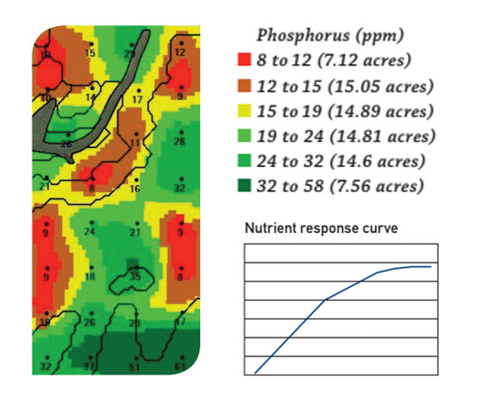
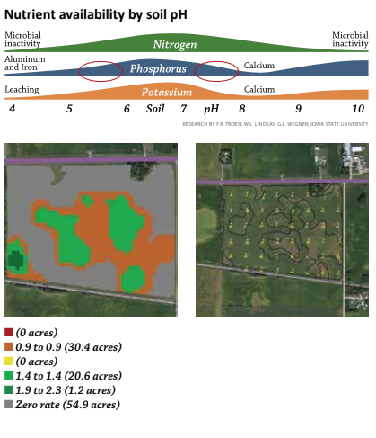
But there are at least three other reasons variable rate lime applications make sense. In many parts of the country, fields also have high pH areas. Applying a flat rate of two tons of lime on a field that has any high pH soils, makes a bad agronomic situation worse as phosphorus availability is just as adversely affected on high pH’s as it is with low pH’s.

Another reason that is seldom talked about is organic matter mineralization. The bacteria that are needed for mineralization cycle aren’t active in low pH’s. Correcting pH can keep the soil’s natural nitrogen engine working well.

The third reason is an old one made new again. As we start to embrace IPM practices – crop rotations, herbicide rotations, cultural practices, etc. – to deal with weed resistance, soil applied herbicides will be part of the solution. And some of the most effective products have pH interactions, including carryover to other crops in your rotation. How will your advisors make the best recommendation without a pH map of each of your field?

There are many reasons to variable rate apply lime, but you can’t consider them without an accurate geo-referenced soil sample. It’s a great way to get started and the savings in lime cost by only treating the low pH acres will more than pay for the cost of the soil sample!

Discover Agronomic Synergies

Is it possible that 3 and 2 can equal more than 5? That’s the concept of synergy – when the “whole equals more than the sum of the parts”. Within our company, we talk a lot about agronomic synergies. We see it in data analysis and we believe that discovering and capitalizing on agronomic synergies is an exciting part of our future in using data to make better decisions.

Listen to Dr. Scott Murrell, director of International Plant Nutrition Institute, talk about nutrient research. “Most of the studies I read look at plant responses to one nutrient, and of those, nitrogen (N) gets most of the attention. But occasionally, more accurately, rarely, I come across a study that looks at two or more nutrients.” He goes on to cite two studies.

premiercropblog_IPNI_nitrogen_kansaspremiercropblog_IPNI_nitrogen_ohio


Both are great examples of the power of agronomic synergies.

Because nitrogen gets the most attention, our customers have been using their data to refine their N rates from our beginning in 1999. Any deep dive into their data reveals what appears to be the “right” rate that differs dramatically within parts of fields. One of the earliest realizations we had is just how fundamentally “wrong” our historic approaches had been. Remember the old formula – 1.2# of N per bushel of yield goal less credits for manure, legumes, and other sources of applied N.

premiercropblog_totalnitrogenratebyorganicmatter

Using that approach would lead us to put more applied nitrogen on our best and frequently highest organic matter soils because they have the highest yield potential. But our finding years ago, showed that our best soils have more ability to furnish soil-supplied N from mineralization than our lighter soils. The data would show that we actually need more applied N per bushel produced on our lighter soils than our best soils.

But even that statement is a generalization that captures only one (yield by organic matter by applied rate) of the many synergies that are part of the nitrogen puzzle. We’re excited to empower growers and advisors to discover and capture all the other agronomic synergies that are waiting to be unlocked in their fields and their data!!

Our goal is to make 3 and 2 turn into 32 = 9!!!

Learn more about variable rate farming.

Data May Reduce Rent

When I’m visiting with growers and advisers, I frequently say that maps are a great way to view data, but the real power lies within the data file that the map represents.

In the ’90s, when yield mapping first became possible, if growers were asked what they learned from their maps, a common response would be “drainage pays.” It’s easy to visually correlate a wet spot with with the low-yielding area of the field because in some cases, you farmed around that area all season long.

can yield maps help with drainage tile placement

Some growers used that visual display of yield loss on a yield map as a tool to create a dialogue with the landowner about the need for drainage tile. The data file that the map represented enabled the discussion to go even further and identifying an obvious problem; it quantified the problem economically. There have been thousands of rented farm ground acres that have been tiled by growers who used their yield maps (and their yield data files) to negotiate an appropriate solution with the land owner.

can I lower my land rent with my yield maps

Some growers make it common practice to share their yield maps with their landowners, while others don’t believe their cash-rent landlords have any business knowing how their fields yielded. The competitiveness of cash rents in many markets makes discussions with landowners stressful and can lead to cautious approaches. Certainly all landowners are not the same, and what they value is different. As we head into tight profit margins, consider what other data-driven discussions you might have with your landowners.

Consider using your soil type maps. In some areas and with some fields, soil types can have a major impact on yields. You can’t change soil types, but when your data says soil types matter, can you manage them differently? Are there soil types or parts of fields that no longer make sense to crop? Does you data suggest that parts of fields that make economic sense to farm at $7-per-bushel levels no longer pencil out at $3.50 per bushel? Does your land owner understand the economic impact of deer herds using the edges of your fields as an all-you-can-eat buffet line?

Rent negotiations can be difficult, but your data is the starting place. Can you use your data to rank each field by profitability? Obviously it’s not as easy as the highest- to lowest-yielding, as costs of inputs and operations, as well as land costs, are major pieces to be considered. Rank your fields over multiple years.

Farming is a business, but what makes it most enjoyable are the relationships that are built, and having those relationships an be an important foundation for rental agreements. Use data to drive your decisions and to enhance those relationships.

Premier Crop Announces New President and CEO

Premier Crop new CEO Darren Fehr

Premier Crop Systems is pleased to announce that the Board of Directors has appointed Darren Fehr as President and Chief Executive Officer and a member of the Board of Directors effective immediately. Fehr previously held the position of Director, Sales & Marketing with Premier Crop Systems and will succeed Dan Frieberg. As Dan transitions toward retirement, he will remain actively engaged in the company as Vice President, Technical Services.

Barry Schaffter, Chairman of the Board of Directors, explained, “The Board of Directors is very pleased with this leadership transition, which continues to build on the strength that Premier Crop has developed in the market.”

Premier Crop has been in business since 1999, founded by Frieberg. Frieberg states, “I am thrilled that we will continue to build seamlessly on the momentum we have created. Darren has the leadership that I believe will take this company, our partners and our customers to succeed beyond what they ever thought they could achieve. I will continue to help our customers use their data to make better decisions and look forward to the growth in the future.”

Fehr joined Premier Crop in February of 2018 and has successfully led the company in significant growth over the last two years. His passion for mentoring, leading and growing the business will be instrumental in the future of Premier Crop.

“Premier Crop Systems is a company that thrives on seeing our customers exceed their own expectations and I am honored to lead this exceptional team. My strategic goal is to be clearly focused on developing our Elite Advisor Network so that our products and services continue to be in high demand from the professional farmer. Together, we have a tremendous opportunity ahead of us,” stated Fehr.

Don’t Farm Averages

Sometimes “averages” can be your worst enemy.

Everyone has heard far-fetched examples that illustrate the problem with “average.” Picture standing with one foot in ice-cold water and the other foot in steaming-hot water – the average of the two is OK. Sometimes that’s what using averages can do in your farming operation.

An example would be using average as you consider your fall nutrient budget. Tighter, even negative, margins will cause many to scrutinize input spending this crop year with much more intensity. Unfortunately, too many suppliers will simply calculate the most nutrients that can be applied for your per-acre budget and apply those rates on every crop acre. For all the headlines about precision agriculture, the majority of nutrient applications are still the same blend applied across every acre.

Agronomically, a better answer is to focus your input dollars in the site-specific areas of individual fields that will provide you with the most economic return on your nutrient investment.

At some point in our farming history, all of us have seen a nutrient response curve. Applied nutrient response curves tend to have these similar characteristics – steeper at lower levels and flatter at higher levels. For example, most of understand that generally we get more yield response for the first 50 pounds of nitrogen applied than the last 50 pounds. Finding maximum economic return is the basis for nutrient response curves.

dontfarmaveragesphosphorus

Think about response curves as you review the soil test phosphorus map above (expressed in parts per million – double the numbers if you are used to pounds per acre). If you composite-sample this field, the average is 20 ppm of P – running parallel with many university threshold levels where a response to applied P can be expected.

Using university recommendations as a reference, virtually any type of georeferenced soil sampling will reveal that in this field, spreading the same rate of P on every acre will result in no yield response is 50% of the acres (the green part of the map). As bad as that might seem, there is a decision even more economically harmful. Making a decision to not apply any phosphorus because the field’s average soil test level is 20 ppm would likely result in lost yield in 50% of the field (red, orange and yellow areas).

None of us can control or even predict all the curves of Mother Nature can throw our way. But using data from your fields opens the door for you to manage the crop production variables that are manageable. The fall’s tight economics area great time to put all your data to work – to stay away from averages. If you don’t have school data, now is the time to get started. The cost of a good grid soil sample spread over the normal four-year life equals less than one-third of 1% of your production cost.

Collecting and using your data can move you away from defaulting to using averages and getting average results.

Using Data to Measure Hybrid and Variety Performance

The age-old agronomy equation is, “Yield Equals Genetics (G) by Environment (E) by Management (M).” There is a lot of focus on using data to measure hybrid and variety performance, in other words, to sort out the “G” part of the equation. That can start with your own data and but it can also include being part of “group, pooled or community” data. This allows you to anonymously see yield results from both genetics you planted and didn’t plant. Being able to filter results by rainfall, GDU’s and soils helps to address the factors that make up the “E” factor and get closer to apples-to-apples comparisons.

Many times, group data analytics generate results that reduced the comparisons to a single number – the average yield per acre for each hybrid or variety. Many times, that can have the effect of “masking” the deeper story in the data. Another way to visualize genetic performance is to see the yield distribution as a percentage of yield observations.

premiercropblog_yieldperformancebyhybridperformance

The blue image is Hybrid A, a popular choice, which averaged 182 bu/acre on 12,560 acres across a local market.

The red image is Hybrid B, another market leader, which averaged 192 bu/acre on 14,712 acres in that same area.

Now look at the yield distributions overlaid. Perhaps this is a more “honest” way to understand yield comparisons.

There are some situations where Hybrid A was actually better than Hybrid B, even though the overall average was 10 bu/acre less. Likewise Hybrid B had higher yields per acre more often than A.

When you visualize data in this manner, it’s easy to understand why one grower can claim Hybrid A was far superior to Hybrid B and yet a neighbor can document just the opposite experience. The real power in data analytics is understanding the situations where each hybrid excels! “Understanding the situations” is really about the “M” part of the yield equation. Realistically, there are a lot of great hybrids and varieties available for most crops. From my perspective, the equation is (?) looks like this: Y = g x e x M!!!!

Management matters far more than most people realize!!!

Thankful for Harvest Bounty

I’m writing this before one of our great American traditions with agricultural roots – Thanksgiving – originally a time to be thankful for the bounty of the harvest. The 2017 crop year harvest has been a surprise to many. How is it possible to produce so much with such adverse growing environments? Here are just two Iowa examples:

1st year corn – average of 247 bu/ac with .81″ of rain in July.

Corn on corn – average of 233 bu/ac with .74″ of rain in July.

How is it possible that during the peak of vegetative growth, when the plant is demanding the most water, the corn plants can sill produce so much with so little rainfall?

Likewise, how is it possible to produce an average of 252 bu/ac with 22 inches of rain in April through July in central Indiana – when it never stops raining, fields are water logged and there are virtually no good days to do field operations?

I’d like to take this time to make a point about how amazing our modern corn production is and can be and to share some thoughts on why we grow corn.

Borrowing from a Tamar Haspel’s Washington Post column from a few years ago, titled “In defense of corn, the world’s most important food crop”. In her column, she converts corn yields to calories/acre. Seems to me that if we’re serious about feeding the world, calculations like this matter.

premiercropblog_caloriesperacreperharvest

Doing the math for these real world, non-contest examples above – their bushel per acre yields convert to over 21 million calories produced per acre. The Post column provides the scientific explanation as to why corn is so much more efficient (3x) at converting sunlight – through photosynthesis into calories.

We don’t grow corn because it’s what our parents did, because of crop insurance subsidies or because the rotation helps our soybean yields. We grow corn because it is perhaps the more adaptable and efficient crop ever known!

Every measure of efficiency related to corn production is in need of constant updating. One of the original attacks on corn-based ethanol used 130 lbs. of nitrogen per acre to produce 130 bushels per acre to do the net energy calculation. We have customers that frequently produce over 200 bushels per acre using only 0.6 lbs. of nitrogen per bushel. Agriculture is frequently attacked for using too much water and corn is one of the crops that is cited. But lost in those debates is that 80% of the U.S. corn and soybean crop is rain-fed, not irrigated. The water we are using to produce most of our corn and soybean crop isn’t an either/or proposition. It’s not, either agriculture uses it or Los Angeles does. We use a fraction of the rain water that feeds our crops and leave most of the biomass produced in the field to recycle carbon and nutrients.

We have serious environmental and public policy issues that we have to continue to address but data from fields like yours shows constant improvement and efficiency. I get the luxury of seeing real world data that tells the story of an ever increasingly efficient production system. Every year, we not only produce more yield per acre but we squeeze more bushels from every pound of applied nutrients and more bushels per inch of rainfall!

Published in Corn and Soybean Digest Nov. 2017.