
Hunters and soil scientists may seem like an odd pairing but they have at least one thing in common — they know and appreciate that nature has an aversion to straight lines. Hunters spend a lot of time in and observing the great outdoors and getting an up-close look at the variability Mother Nature molded upon our landscape. Soil scientists not only spend time looking at the curvy contour lines that represent the transition from one soil type to another but their academic training is about the “how’s and why’s” of soil formation over the centuries.
Unlike nature, humans have figured out how to perfect designing making straight lines! From early days of the very first mechanical planters and “cultivator blight”, the straightness of our rows was something that created neighborhood envy. Nowadays auto-steer has made it easy.
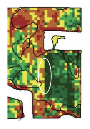
Straight lines are one of the first “gotcha’s” when studying a yield map. The cause for yield differences that follow straight lines are always man-made! It can be a variety change, a different nutrient application, a crop protection treatment, an equipment performance issue, a tillage pass or even something like a manure application we did years earlier. Seeing a straight line on a yield map instantly leads to digging deeper!
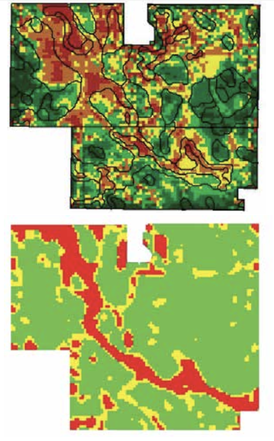
Yield maps are an awesome way to visualize data differences however a second “gotcha” is not paying attention to the map legend! Years ago, I had a college friend send me an image of one of his yield maps, with a note that said “you see, we really don’t have much variability in our area”. But as I studied his map, I noticed that there was the predominant green color on his yield map had a 40-bushel- per-acre range.
The two maps above use the exact same yield data.
There is not a “perfect” way to set map legends. The key is to also LOOK AT THE LEGEND — not just the map!
Originally published in Corn and Soybean Digest.