I was meeting with a grower who asked the question, ‘Is the direction of Premier Crop going from a prescription company to an analytics company?’ My answer was: ‘Premier Crop has always been about analytics. We are not only a company known for analytics, but what to do with the information that is received within the data, in those analytics.
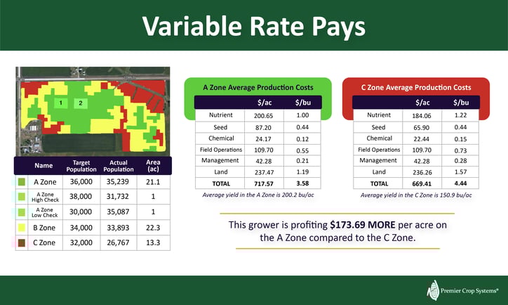
I could kill you with paperwork. But really, it’s about the reports and insights that I can take to be able to help growers make better decisions. The report I’m walking through today is our Management Zone Report. This report is almost like a report card for a grower because it showcases the cost per acre in each of the management zones. In this report, you’ll see that we’ve invested more dollars per acre for nutrients and seed. The chemical costs, operations costs, management and land are going to be flat rates, or they’re equal across each of these zones. When we get down to the very bottom of this report, we can see that we’ve invested $48 more in our A zone, our best parts of the field, than in our C zone. When we look at that break-even cost per bushel, or the amount it costs us to produce a bushel of corn, it’s $0.86 cents less in our A zone compared to our C zone, even though we spent more money to produce it. It’s amazing to actually be able to use this report to illustrate to a grower that variable rate does pay.
Let’s do the math on this report. If we’re yielding 200.2 bu/ac bushels in the A zone, and I’m using a selling price of $4.50 for corn, that would bring us to $900.90 of revenue per acre. If we take out our cost per acre of $717.57, that’s going to be $183.33 profit in that A zone versus our C zone yielding 150.9 bu/acre and revenue of $679.05, which is $9.64 revenue per acre. That’s $173.69 more per acre in your A zone.

Now, we an produce reports and pretty graphs, but it’s so much more than that. I’ve always laughed and thought: What other business takes a look at a pretty map or graph and says, “That’s really neat!” and puts it in a 3-ring notebook in their office without doing anything about it? This is where the agronomic advisor should come in, take that data and ask, “What can I do with this?”
Another part of this Management Zone report shows the soil test attributes, applied, and removed nutrients in each of these zones. As an advisor, I can very quickly look and see what the average applied nutrients were in these zones and the actual nutrients that were removed within these zones. With so many inputs (P, K, Seed, etc.) being variable rated, it helps me to get the complete picture and help growers make sense of what happened in their fields and how we can improve next year.
As we’re going into the fall with these fertilizer inputs — and, actually, all inputs — being what they are, growers are going to be concerned. I’ve been telling people for the last month, my worry is that when farmers get shown these prices, they could make some emotional decisions. In fact, those emotional decisions. In fact, those emotional decisions of cutting across every acre could be cutting profitability in the areas where they could be returning the most.
So the question is: how can we take this information to make a better recommendation or a better prescription for next year’s crop.
First, we have to figure out what we actually have control over. There’s so much in the data world and there are certain things we don’t have control over. So, let’s look at the things that we can help growers with. I’m not saying to starve out any area, but instead, reallocate. What does the grower’s pocket book look like for a given field? I chuckle when growers tell me that their yield goals are the same across every field. If you treat every field the same, you can’t tell me that yield goals or, on the flip side, removals, are the same on every field. We’re talking about removals spatially, with that yield file. That’s a huge variance.
When you’re in the combine, and you’re watching the monitor, you see those high areas of the field. Well, those high areas of the field are removing a lot more nutrients than when that monitor hits those red areas on the map. That means if there’s a big difference in yield, there’s a big difference in removals.

Using that removal file as part of a grower’s nutrient plan or recommendation is going to be really big this coming year, in addition to establishing the goal for that field moving forward for this following year. What kind of a goal are we going to have based on input prices? I sent an email to one of my growers last week, and said: ‘We really need to talk in the next 10 days. If prices are going to remain as they are, what are you thinking for fall fertilizer?’ We’re going to need to put some on, what does it look like if prices stay this way? Then, how do we pivot as we move into harvest season and that sort of thing in order to prevent those emotional decisions? Growers with a plan don’t make emotional decisions. They’re a lot more confident and a lot calmer in fall and harvest time.
I share all of this to prove to you that variable rate clearly pays. So, what if you were to flat-rate this whole field? What would this look like? I mean, you would clearly be losing your money in the C zone, more than if you’re over-applying your nutrients. There’s a clear reason that these reports show that the profitability of variable-rate pays. Using something like Premier Crop and looking at the farm analytics is highly beneficial. If you are only using yield as your measure of success, you really don’t know how much money there is out there that you’re missing out on.

