When Two Negatives Make a Positive

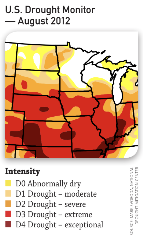
When we look back to 2012 it was historically dry, and 2013 started out wet and then turned dry. As some growers in the Midwest face yields below expectations, they’re finding new and different ways to learn from their data.

During the 2012 drought, north-central Iowa growers learned that they were being overly aggressive with plant populations on some lighter soils. This was a new trend for them, as abundant rainfall in previous years had masked these soils’ lower water-holding capacity. Since then, growers and advisors have paid more attention to those areas.

“We took the lemons of 2012’s lower production and made lemonade. We learned from the yield data and fine-tuned our management zones to apply more realistic seeding and nutrient rates on those lighter soils,” says Ben Rahe, a Premier Crop agronomic information advisor.

Northeast Indiana learned some valuable lessons from the 2012 drought, as well. “Even though yield information was so poor, we still had a lot to talk about with our growers about their management zones and what percentage of ground was in each A, B and C zone,” says Brian Warren, an agronomic advisor with ProTech Partners in northern Indiana.
 

Screen Shot 2018-09-18 at 11.38.18 AM


Warren also found that with their 60-to-80 bushel crop in 2012, weather needed to be a bigger part of the equation. “If a bumper crop is roughly 200 bushels, and a grower averaged 80 bushels in 2012, we learned that 60% to 65% of what contributes to yield is variable, and the other 40% to 35% is contributed by management.”

Warren made lemonade by amending management zones for the future.

“Every crop season, we try to identify each field’s yield-limiting factors,” says Rahe. “in a wet spring/dry summer year like 2013, that may mean using yield data to more accurately determine where to invest in additional tile drainage. We make the best of extreme weather conditions by learning how a field response to them. We then discuss with the grower what can be done to fix those yield-robbing items.”

Having a geographically broad information source can help with getting through tough years. “Due to weather, I’ll have some growers with well-above-average yields and some growers with one of their lowest-yielding crops,” Rahe says. “The positive of this yield variability is that as an advisor, I can apply what I learn to both growers. For growers with low yields, I can show them anonymous information from those who were more fortunate. What may feel to them like a ‘lost’ year of information educated them. And for those with good yields, I provide them with a watch list for extreme-weather years.”

Extreme weather conditions can uncover variability that growers and advisors have never seen, reinforcing the value of field-by-field management and accentuating the importance of site-specific decision-making. Assessing your yield data with a trusted agronomic advisor improves your odds against Mother nature’s curveballs.

GOT DATA?

1. Capitalize on a relationship with an agronomic advisor who isn’t as geographically centered as you. Prepare five questions to ask him or her about what worked for other growers who didn’t suffer from adverse conditions.

2. Study the big yield-limiting factors – like drainage or managing drought-prone soils. What decisions can be made from those lessons learned?

Originally published in Corn and Soybean Digest December 2013.

Find Profit in Data

There is a popular reminder used in crop production to spur a sense of urgency. It goes something like this: “You only get to plant a field 40 times in your farming lifetime. If you rotate crops, you might only get 20 chances to get it right with soybeans or corn.”

I’ve always loved those motivational do-it-now, make-the-most-of-every-day, you-can-rest-when-you-get-to-heaven-type messages, although I suspect psychologists would argue they are responsible for many of our “unbalanced lifestyles.”

Let’s assume you are motivated to get started using your agronomic data to make decisions. What do you do next? Spring planting is hopefully only days or weeks away; what is possible?

A great place to start using data to make decisions for the future is to gather all GPS data in an electronic form. Whether you use the data this fall, next spring or a couple of years from now, whenever you are ready – it’s just a click away. Paper maps are a start, but you can’t put them into the computer. Yield, soil tests, boundaries, any planting data you have or are going to gather – put it on a USB stick in the “raw data” format.

“We have been using a yield monitor for a long time and have saved data on a USB drive since 2006,” says Jim Krug, a grower from east-central Iowa. “Until recently, it has just stayed there on the stick, since we hadn’t been able to figure out how to use the information. The technologies are here; we have to utilize them. We wanted someone we could trust to sit down with us and go through the data so we can make important management decisions. Our agronomic advisor helped store and clean up our data, and from there, we now have the ability to capitalize on our investment by making the data work for us.”

Krug expects to see an ROI by just storing the data electronically over the years and then taking it to an advisor to go through it and analyze the meaning behind it all. The process can be easy if you have the data – especially in an electronic format.

Another way to cover your bases is to take notes about each field. Not all data can be collected on a monitor. Sometimes it’s just as easy to make a note. Organize a notebook with a page for each field and re-examine it with every field visit. After harvest, each field will have its own diary, which might help answer some of your production or management questions, or remind you what to ask an advisor.

With every cop year, look back upon your successes and failures – always striving to become better, more profitable, more diversified. Using your data to make important agronomic decisions can be a great starting place to benchmark your own growth. So when your “40 chances,” are up, you can give yourself a big pat on the back.

GOT DATA?

1. Seek out a local advisor to help you. Most of us don’t really want to become the expert in all aspects of our business. Just as you hire legal, accounting and marketing expertise, look for an advisor who shares your desire to use your data in decision-making.

2. Start collecting more data with your planting operation by logging hybrid and variety locations. Pre-loading your monitor with purchased seed umbers can make the process easier and is a great way to become familiar with the monitor’s buttons and screens again.

3. Order grid or zone soil sampling on some of your fields. Target fields with obvious variability or where you instinctively know you have production issues. Ask your advisor to explain the results.

Surrogate Data

“But how do I know if what I am seeing in my data analysis is real?”

That’s a question that is not only appropriate but also healthy.

For the last 15 years, as I’ve presented agronomic decision data analytics to growers and their advisors, I’ve cautioned that “correlation doesn’t always equal cause and effect.” I share humorous examples – plotting my hair loss and my years of working with farmers – a perfect correlation, but not proof of cause and effect.

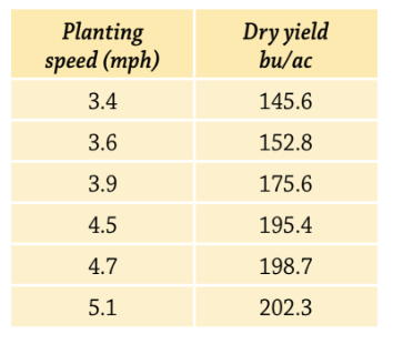
Premier Crop began analyzing the planting speed and yield relationship years ago, calculating planting speed using the time stamp column in the GPS planting files. I remember fields that showed a strong correlation between faster planting speeds and higher yields! This would lead to either father or son arguing that all the attention to slowing down the planter was literally a waste of time.


Screen Shot 2018-09-18 at 10.59.23 AM

However, further investigation would inevitably provide a different explanation. Pressed to get the crop planted and having to compromise what was “ideal”, spring tillage left part of the field with a rough seed bed. The operator planting the field, instinctively slowed down in those rough parts, returning to normal planting speed in the other parts of the field. But even with a slower planting speed, those rough areas didn’t yield as well – leading to a correlation showing faster planting equaling higher yields.

It’s an important lesson that many miss. Sometimes, a data layer is actually a “surrogate” for another layer that you may not have captured. Planting speed was a surrogate for the condition of the planting bed. High soil pH as a surrogate for an eroded area within a soil type or the best part of the field because excess water escaped in a wet year.

Premier Crop focuses on partnering with local agronomic advisors because we appreciate that agronomy is local, meaningful data analysis involves agronomic common sense and local expertise that in most cases includes the grower. Analysis can and does provide insights, creating new agronomic knowledge that allows growers and advisors to understand relationships that were impossible to see before. Yet big data analytics is not the crystal ball that removes local context. Rather, the power of big data analytics is handling the crystal ball to advisors that have local context.

Real world agronomy is complex – very complex. It’s where soil science, soil supplied and applied fertility, plant pathology, entomology, weed science, soil and water conservation, all collide with your technology allowing to measure, analyze and deliver site-specific solutions.

Originally published in Corn and Soybean Digest April 2014.

Compare Field Yields

Got data? You may be thinking, “Yes, I have plenty of it”, or maybe, “No, how do I get it?” Even if you have no precision-ag data, chances are you have this data.

Whether it’s because of crop insurance, the scale at the elevator, or the monitor in the combine – every grower should have average yield data for each field.

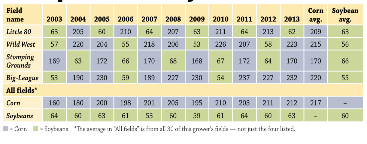
This table is an example of a report that Premier Crop Systems generates for our growers, but you could create a table like this on your own for your operation. The table is fairly simple – it summarizes results by field vertically for each year, and computes the running average yield for each field by crop horizontally. By looking at the table, what are the obvious standouts to you? What decisions would you make?


Screen Shot 2018-09-18 at 10.47.09 AM


Let’s look at the crop averages in the two far-right columns. Field Little 80 does well in both crops, while Wild West does extremely well in corn with an average of 215, but poor in beans. Stomping Grounds is the opposite, with poor corn averages, but great in beans. Big-League is much like Wild West in the sense that it does very well in corn and not well in beans.

By looking at the yields per year for each field, you can easily pick out which fields are better in a corn-on-corn rotation and which fare better with a traditional corn-soybean rotation. To dig a little deeper, can you tell why they do better with that specific rotation? What might cause these differences? Soil type differences? Drainage? Manure history? Insect issues? Soybean cyst nematode? Are there fields where you get a yield dump in soybeans when they bump in soybeans when they follow corn on corn vs. a corn-and-soybean rotation? These are examples of decisions that can be made from your very own, simple yield data.

To make decisions off of data doesn’t mean you have to have all the data in the world. Start simple and work your way up. With every answer you find, you will come up with more and more questions – it is one of the best side effects of analyzing your field data! The grower with even the smallest acreage can make decisions off of his data – because he has it! It just takes a little time to sit down and dig deeper into the numbers that hover around 160 and 50.

Originally published in Corn and Soybean Digest.

Build Your Nutrient Data

In case you haven’t heard, there’s a target on your back! Our modern crop production system is on a collision course with the non-farming public who are becoming more removed from farming with each generation. Many outside of agriculture, including regulators, associate high-yield crop production with being environmentally reckless.

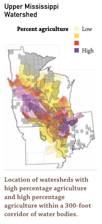
The EPA and states located in the Upper Mississippi watershed are developing strategies to deal with nutrient water quality issues. Even if you don’t farm within this watershed, your farmland is located in another watershed. Every grower needs to be involved in this issue.

As the debate heats up and you find yourself attending meetings addressing how you manage nutrients, you will likely hear the term, “nutrient use efficiency” (NUE). In the case of nutrients, like N, NUE is a data calculation that Premier Crop has used since our start: total “pounds of applied N per bushel of corn produced.” I like to think of the NUE discussion as “how can I squeeze the most possible yield out of every pound of N I apply?”

Future NUE discussions may be driven by environmental concerns, but our drive has also been increasing growers’ profitability though more efficient nutrient use. We believe that your dat is a vital part to having the best of both worlds – producing high yields and being an environmental steward.


Screen Shot 2018-09-18 at 10.35.20 AM


In a column that has national reach, it’s difficult to address any specific nutrient management solution because it changes dramatically by local areas. In the Upper Midwest, we are blessed with highly productive soils that are high in organic matter.

Recent university studies show that on average, 50% to 70% of the N that feeds our crop is soil-supplied, not fertilizer-supplied! This means we need to better understand the differences in N-supplying abilities of different management zones in our fields, across farming operations and throughout local areas.

As the late management guru W.Edwards Deming said, “You can’t manage what you don’t measure.” A great starting place for using your data to manage N is calculating your NUE (total “pounds of N per bushel produced”) for each field and by N-management system. Another starting place is to put higher and lower N-rate Learning Blocks within a field’s management zones – the high check Learning Block being 30 pounds more N, and the lower check bing 30 pounds less.

Where is your baseline on becoming a better nutrient steward? Your answer should be your data. What better way to find out the truth about how nutrient efficient you are than digging deeper into your yield, soil test, management zone and applied fertilizer data?

Throughout this column we refer to your data being critical to solving problems, but what may be missed is the word “your.” Understanding that your data is yours, and yours only, is of great importance. There is nothing anonymous about GPS data. Be careful – don’t volunteer your data unless you’re sure of the benefit.

GOT DATA?

1. What is your “average pounds of N per bushel” for each of your fields? What are the year-to-year trends? Can you use your data to measure NUE difference within your fields?

2. What other data relates to NUE in your fields? Soils? Organic Matter? Cation-exchange capacity? Management zones? Soil test levels of other nutrients? Past manure applications?

Originally published in Corn and Soybean Digest.

Cost Per Bushel

Premier Crop has been challenged by growers and industry skeptics. The recent euphoria over the value of grower’s data has been a welcome change in that more growers are starting to value their data and wonder how to best put it to use. But having spent so much time with growers, I know that in the end the ultimate credibility test for every data offering will be “does it pay?”

And that’s where we started as a company. Our goal wasn’t just to use growers’ data to help them drive yield, but must more importantly to drive profitability!

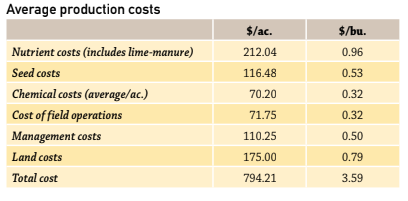
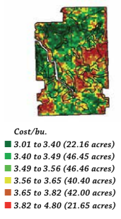
Our answer was to create a robust database that could not only track agronomic layers and input treatments but also the costs associated with each treatment plus land, management and cost of field operations.

When we started in 1999, there were many years when the grain market provided very few significant swings. The challenge of developing a solid grain marketing plan started with knowing your cost per bushel. We took that challenge to the extreme – providing grower with a cost per bushel map that included tracking costs down to 1/10th of acre increments.

Screen Shot 2018-08-17 at 2.00.03 PM

A simplistic approach would have been to take whole field average costs and divide them by the yield field.

Our approach is much more accurate. If a variable rate nutrient application called for more nutrients to be applied in an area of the field, the cost of those nutrients was processed with the nutrient application field. If seeding populations were higher in a management zone, the associated cost of extra seed was tied to the planting file when it was processed.

Screen Shot 2018-08-17 at 2.00.08 PM

This practice is a lot of work but the results provide analysis that can make critical decision making easier. Over the years, growers have used cost per bushel maps in many different ways. To have meaningful conversations with landlords. To change crop rotations on fields that show a profit advantage on one crop and not another. In some cases to decide if there are areas of a field that should not be cropped and might fit better with a conservation use. One farming operation used their cost per bushel data to grow in another direction where the combination of land rents and yields were more profitable.

Accurate cost per bushel information is highly confidential and can provide the ultimate benchmarking solution as it goes much deeper than just yield but compares the economics associated with those yields as well. Imagine the power of knowing your long-term average cost per bushel by dominant soil types. Maybe you’ve mastered being profitable on lighter soil types and that is one of your strategic advantages.

The knowledge you create from your data can be powerful in managing your farm and the risky involved in farming today.

Got Data?

  1. What strengths does your data show? Where does it suggest there is room for improvement?
  2. How might you use your data to manage risks in this growing season and beyond?

Color Blind Data

I grew up attending a small rural Iowa Methodist church and the theology from the pulpit was all about being “color blind”. Of course, the irony was that we all looked the same. The color blind theology was all about seeing beyond the surface – looking deeper to find real values versus making judgements based on what’s on the surface.

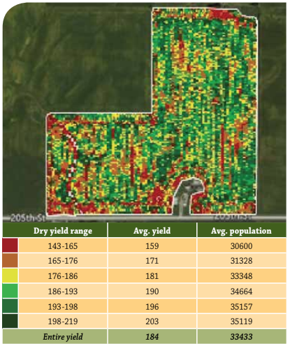
The agronomic and economic data from each part of all your fields can be a powerful tool that allows you to look deeper than what is on the surface. Maps are a great way to visualize data – but the combination of the data layers that each map represents will allow you to gain new and valuable knowledge that can drive more profitable data-driven decisions.

Decades ago, before Premier Crop, I asked one of our most reliable employees to prime and paint a piece of equipment. The primer coat was a red color and the priming process went well. But when it came time for the final coat of dark green, the results weren’t so good. There were obvious missed spots on every surface.

It was one of my first encounters with red-green color blindness. Red-green color blindness is the most common form of color blindness, impacts men far more than women and can affect almost 10% of those of us with European heritage.

Virtually all precision ag companies love to display data using colorful maps. Premier Crop is just as guilty as any other company of ignoring the 10% of our customers that can’t see differences in our red-to-green yield maps.

Screen Shot 2018-08-17 at 1.20.31 PM

Throughout our history, I’ve always thought color blind growers understood our message more quickly than others – that the power is in the data. They have no choice but to get beyond the pretty map phase.

The best data is the color blind! it doesn’t care about the color of the seed logo, the equipment used, the nutrient package or crop protection choice. it isn’t cleansed or stored or manipulated to tilt the results in one direction or another. Color blind data has no stake in what product or rate wins.

Maps can help tell us where, but data can tell us what, how much and why!

Did planting higher populations in the best parts of the field pay? Your data can answer that question. What color blind story does your data tell about hybrid and variety performance? Did your seed treatment result in higher yields? Does fungicide timing matter? Did that late season nitrogen pay for the extra trip? Look beyond the surface – be color blind and look deeper in your data for more value.

Data Builds Confidence

Are you confident? Where does that confidence come from? From your life experiences? From your successes? Even your failures? What about the decisions you make in your crop production business? Are you confident in the decisions you make?

I believe that many of the decisions we currently make in crop production are based on our observations from previous experiences. Almost subconsciously, we make observations as we go through each crop year and those observations are stored away in our mind and later retrieved as part of our process for future decisions-making.

We observe yellow corn where an applicator knife was plugged and that observation becomes part of our future decision making process. The importance of uniform emerging picket-fence-spaced cornfields largely started with growers and agronomists observing plants and ears as they walked their fields. We remember what it was like to observe six inches of early April snow on our planted fields, and we tend to store that emotion away.

The power of human observation can be incredible and lead to great innovation, but the downside is that each of us also bring our own biases. Our observations are tinted with the lens of our own life experiences.

One way to think of using your agronomic data to make better decisions is think of your yield monitor as an “unbiased observation monitor”! Every second, it allows you to observe yield results for that unique part of your field. You are collecting yield observations thousands and thousands of times across your operation. Technology allows you to “scale” the power of unbiased observation! The hybrid that looked so good to our human eyes can be eliminated from our portfolio if the data analysis from our unbiased observation monitor doesn’t prove it worthy. The more observations we have the more confidence we have in making decisions.

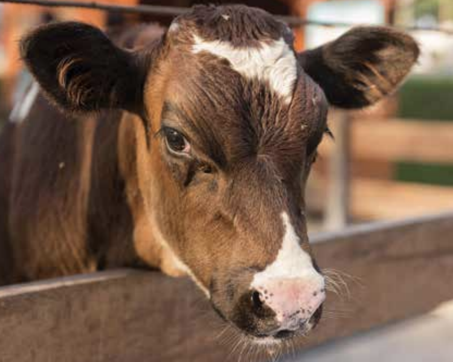
When we first started Premier Crop, I drew the comparison between what we’re doing with Premier Crop and the Dairy herd Improvement Association. DHIA is a record-keeping data-base system that documents production by the individual cow – same as we’re doing within tiny areas in fields. DHIA allowed dairy farmers to benchmark each cow’s performance, not just to the other cows in the herd but also to other cows in the database.

Screen Shot 2018-11-21 at 2.30.02 PM

Virtually every management decision that has been made in the dairy industry since has been based on data. Genetic selection, nutrition and herd management changed rapidly as the entire industry moved to data based decision-making. DHIA, once a management practice used by a few innovators, grew to become an entire industry’s standard operating procedure. The swine industry followed and now virtually all pork producers participate in some detailed database program.

Data driven decisions empower growers and will change crop production forever.

Compare Real Benchmarks

Telling customers they are underperforming never seemed like a great business model to me. Benchmarking can have that exact effect – 60% aren’t performing well if you remember teachers grading on the curve back in school. Those at the top of the curve might enjoy the satisfaction of knowing they are the stars, but how do you gently push the below-average customers to step up their game?

I understand that benchmarking can be used effectively, but I also know sometimes it hurts. An example of benchmarking many can relate to is the medical community’s use of BMI(Body Mass Index). At my height of six feet two inches, my weight bounces from 220 to 214 pounds, so I move from one benchmarking category to another, leading my very slender, young(and blunt) doctor to proclaim, “Congratulations, you’ve moved from obese to grossly overweight.” I need to get below 190 pounds to reach “normal.”

Benchmarking can serve the purpose of providing as a kick in the pants to exercise more and eat less. The problem with agronomic benchmarking is that the solutions to reaching better numbers aren’t as obvious as exercising and eating less.

When seed companies tell you that the genetic potential of a bag of seed corn is 500 bushels per acre it starts going downhill once you open the bag, it’s almost implied that you are the one who is failing to perform.

Comparing my yields to others in counties I farm might be OK unless I farm the poorest soils in each county; then I might resent someone pointing out the obvious – that my yields are below average. Comparing my yields to those of others who farm the same soils in my part of the state is better, but being labeled in the bottom quartile isn’t fair if I didn’t get similar rainfall. Even if both soils and weather are similar, what about rotations? What about cost of production? maybe all those higher yields came with high production costs.

So what are the keys to meaningful agronomic benchmarking? I’d suggest these as a few of the important keys:

  1. Realistically quantify the growing environment to get closer to an apples-to-apples comparison.
  2. Look long term – for trends over multiple years. Everyone has a great or bad year once in a while, but looking at longer-term trends is more meaningful.
  3. The more depth of data the more value in benchmarking. Depth will provide you with more confidence in the comparison, as well as some answers.

The best benchmarking services don’t just tell you where you rank – they also tell you why. What does the data say you need to change to perform better or keep doing to stay on top?

Compare Apple to Apples

You are likely asked for next years seed order many times before harvest even begins. In that case, one of the first decisions you probably will make using your yield data is which numbers to plant the following year.

Seed plots serve as away to visually see new and current hybrids, making you knee-deep in plot results and “percent of wins” data. But in most cases, your own results and experiences will trump plot books and seed guides.

The basic idea of a plot is to test the genetic potential of a hybrid or variety in a growing environment where other variables are controlled and non-yield-limiting. The results are uniform, Well-drained, fertile plots that frequently don’t resemble the diverse environments that you farm. Because of that, your own data is a great starting place.

As you spend time analyzing your data, you will start to understand that sometimes tables of different varieties are”apples to oranges” comparisons, creating the need to dig deeper. For example, by looking at this “Yield by hybrid” chart, a grower may think the red hybrid is the clear winner. However, if you dig deeper into the data, such as analyzing yield by hybrid by soil type, like in the bar chart, you will notice the red hybrid was not the best when it was in the Alda soil type.

There are other factors you can find when digging though data to make fair comparisons. Consider why one hybrid did better than another. The reality is that some hybrids get the benefit of being in the best possible situation on the best ground, and some get the worst. Strive to identify and more accurately place your genetics.

For example, place the racehorse numbers in the ideal environment and the defensive numbers in less than ideal environments.

The key is to never stop digging for the answer to “why?” It is easy  in all data analysis to have “apples to oranges” comparisons and take data at surface value, but the key to good analysis is to keep digging deeper to get fair comparisons, thus creating the most educated and profitable agronomic decisions.